Our project, Edura, aims to address the educational challenges posed by the COVID-19 pandemic by enhancing the quality of remote learning. We targeted the United Nations Sustainable Development Goal 4, which focuses on ensuring inclusive and equitable quality education and promoting lifelong learning opportunities for all. This project explores how a centralised platform can improve remote learning experiences by integrating essential academic resources like Canvas, Ed Forum, and Zoom into a single interface.

Research and Requirement Gathering
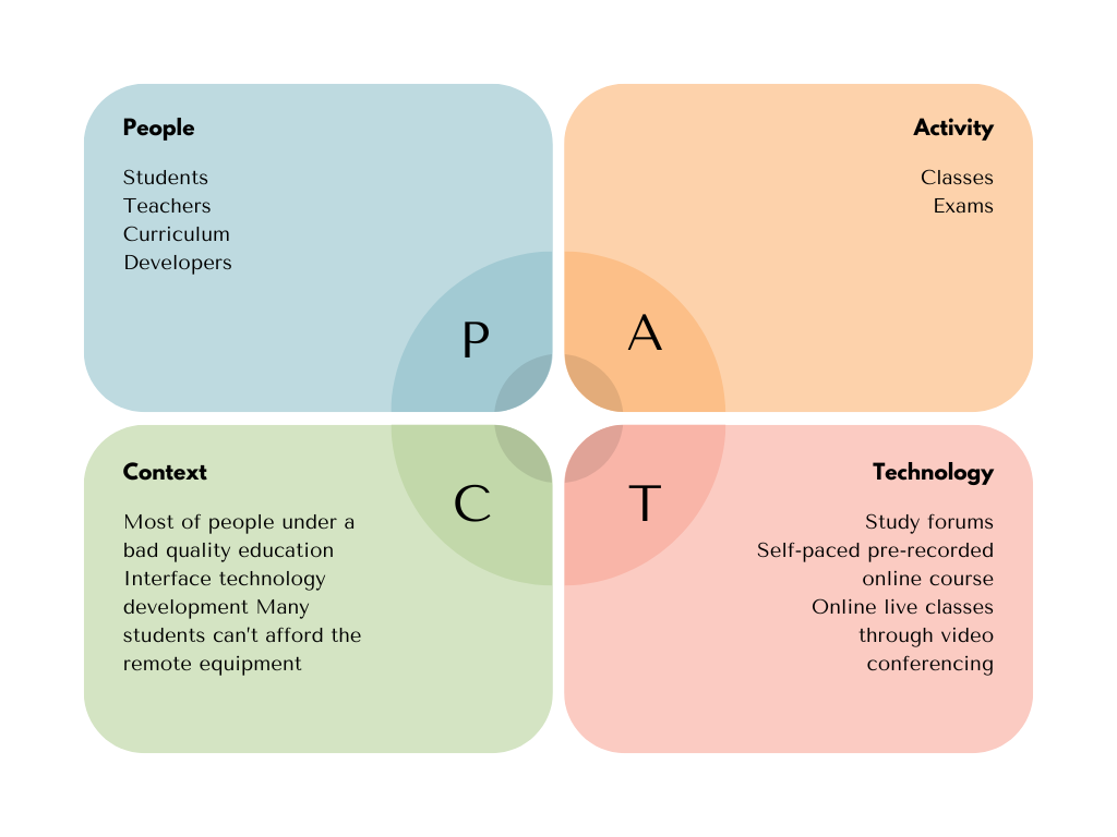
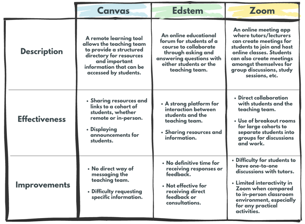
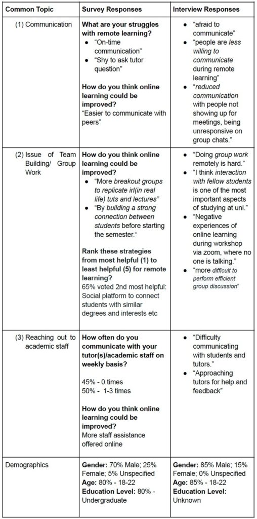
We began with a thorough analysis of the problem space, conducting PACT (People, Activities, Context, and Technologies) analysis to understand the stakeholders’ needs. Our user groups included students and educators, and we used surveys and interviews to gather qualitative and quantitative data. This helped us identify key requirements such as a simple UI design, better team environment, and efficient resource access.
PACT Analysis
Brainstorm Ideas

Competitor Analysis
Interviews and Survey Insights
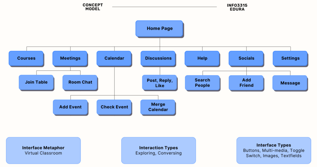
Concept Model and Prototyping
Our design evolution started with drafting three conceptual models, followed by low-fidelity paper prototypes to visualize early design thinking. We refined our designs based on feedback, creating storyboards and wireflows that led to a high-fidelity prototype in Figma. The cognitive walkthroughs and usability tests conducted provided critical insights, helping us improve the interface and user experience.
Persona and Usage Scenario

Low Fidelity Prototype
The following is a photo of the low fidelity prototype.

High Fidelity Prototype and Re-evaluation
Our high-fidelity prototype, developed in Figma, incorporated feedback from initial tests and cognitive walkthroughs. We conducted a pilot study to validate our design and refine the evaluation process. The study’s results indicated that while the social features were smooth, there were challenges with calendar navigation, which we addressed in the final prototype.

Usability Testing and Evaluation
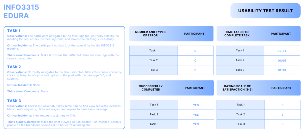
The usability testing process involved three primary tasks: finding meeting details, interacting with discussion threads, and using the social features for communication. We collected both qualitative and quantitative data to evaluate the prototype’s performance. Insights from these tests were instrumental in refining the prototype, addressing issues such as navigation difficulties and button visibility.
Iterations
We plan to use web analytics and field studies for future evaluations. Web analytics will provide quantitative data on user actions, while field studies will evaluate the practical use of Edura in real learning environments. This dual approach will help us continuously improve the platform based on real-world feedback.
Final Solution
The Figma high-fidelity prototype can be accessed here.

Home Screen: The home screen offers a minimalist view that shows a brief app overview, notifications and a mini calendar of upcoming deadlines.
Courses Webpage
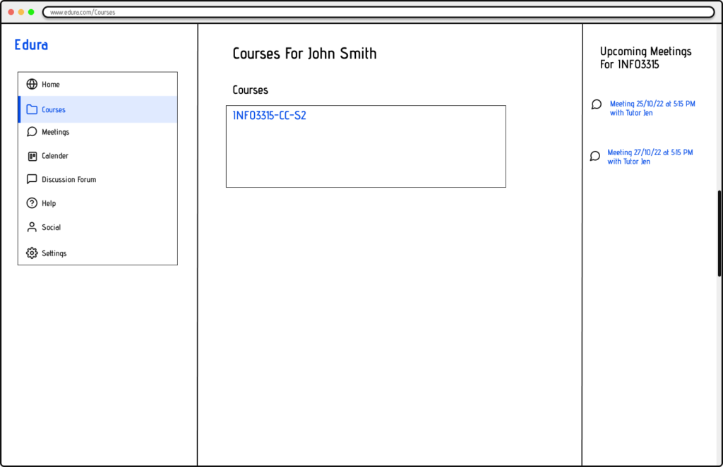
Courses Table Page: Shows a table view of all the enrolled courses.
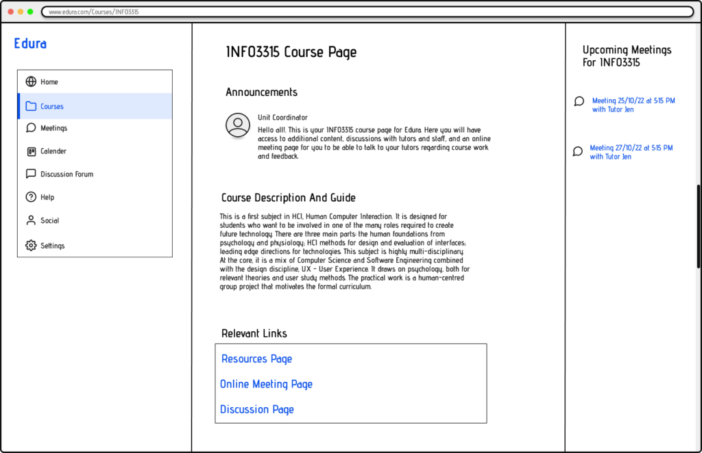
Course Overview Page: Shows the detail overview of a specific course.
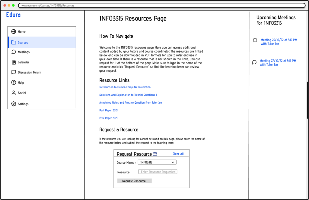
Course Resources Page: Displays the resources and links relevant to a course.
Meetings Webpage
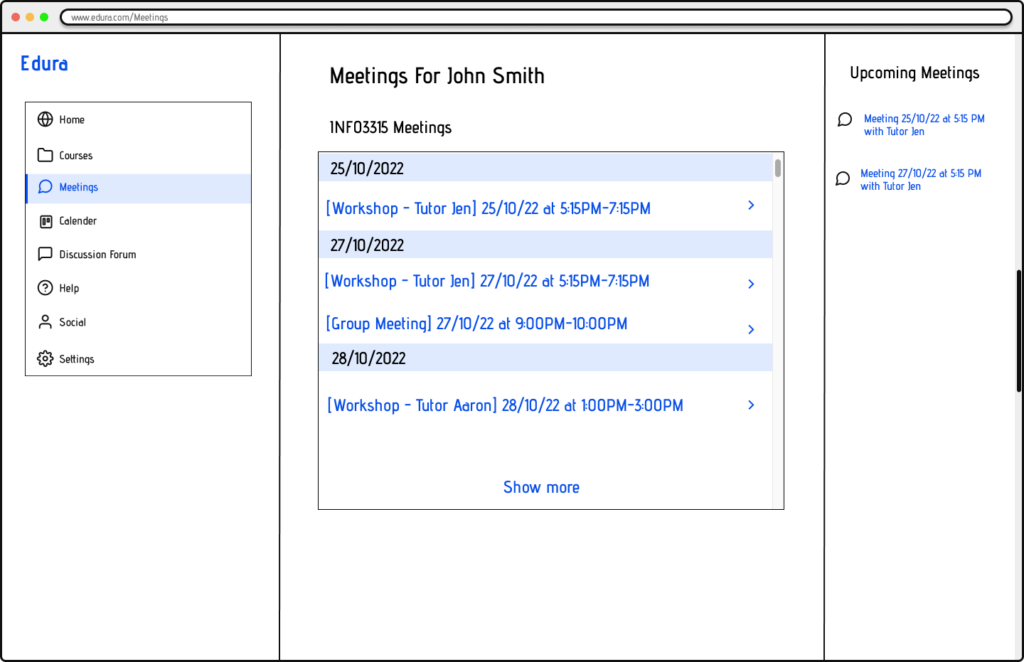
Meetings Overview Page: Displays a list of ongoing and upcoming meetings for the user.
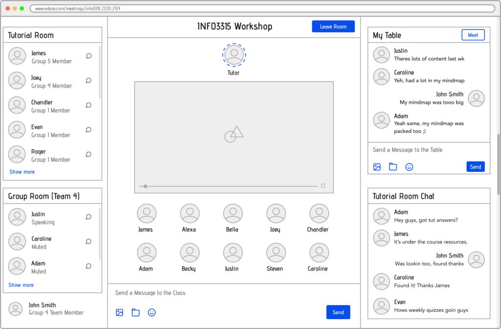
Meetings Page: Virtual meeting room for the classes.
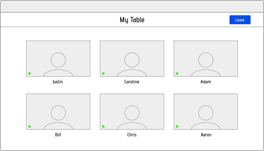
Table Breakout Rooms: Users can form smaller groups of meetings within meetings. To create conversation as a “Table”.

File Upload Popup: Within meetings, users can upload and download files from class.
Calendar Webpage
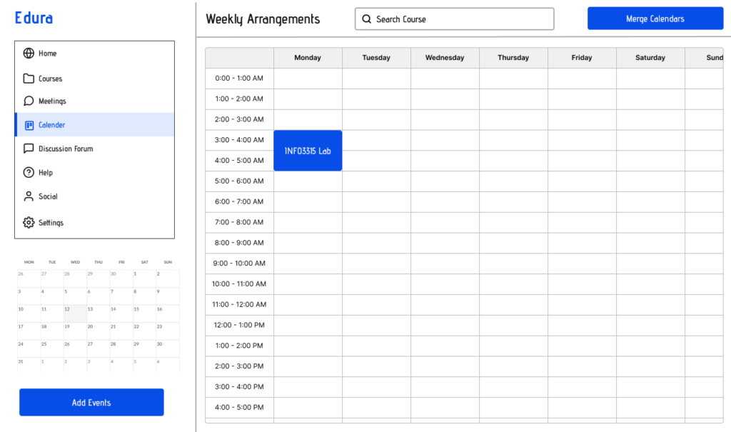
Calendar Overview Page: Displays upcoming schedules in the calendar to keep track of work.
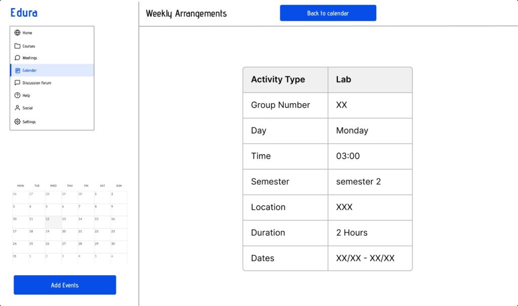
Schedule Details Page: When user clicks into a schedule they can see details of the item.
Discussion Form Webpage
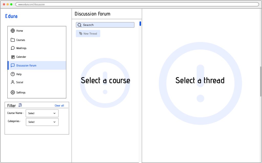
Discussion Page: Allows users to filter discussions they want to browse from the filter box.
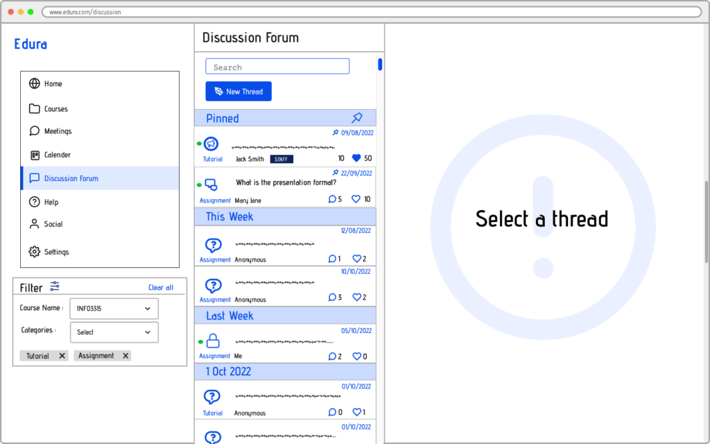
Discussion Details Page: After users selects a unit to browse, a list of all the related threads will appear.
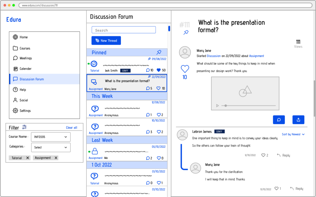
View Thread: Tools for discovering user-generated content and educational resources.
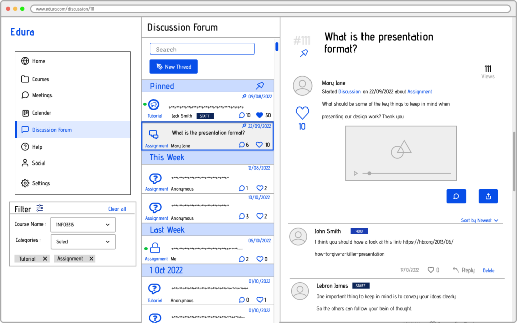
Reply to Comment: Allows users to explore various learning materials and activities.
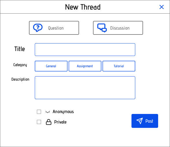
Create Thread Popup: Tools for discovering user-generated content and educational resources.
Help Webpage
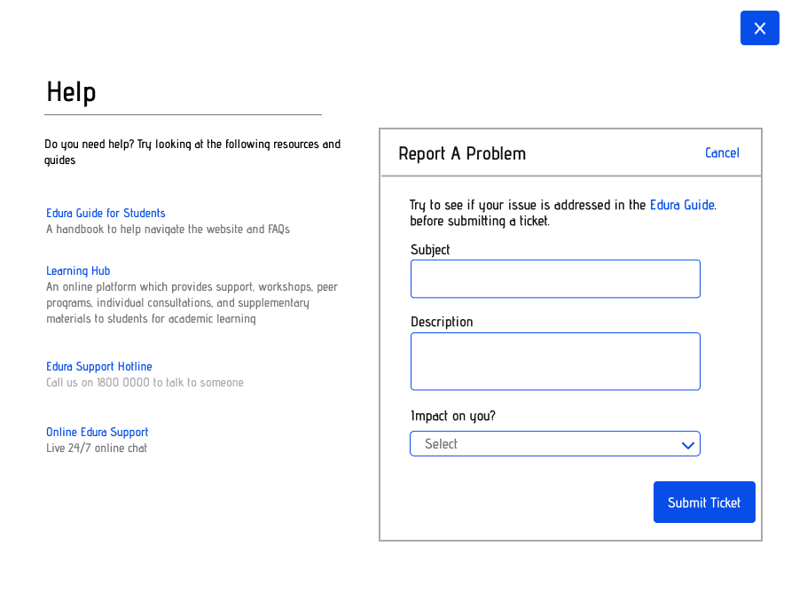
Help Popup Window: The popup window will appear as an overlay when user selects the Help button.
Social Webpage
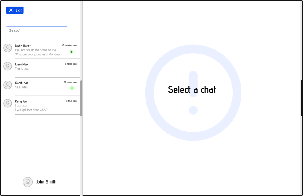
Socials Page: Allows users to access messenger to keep in touch with peers.
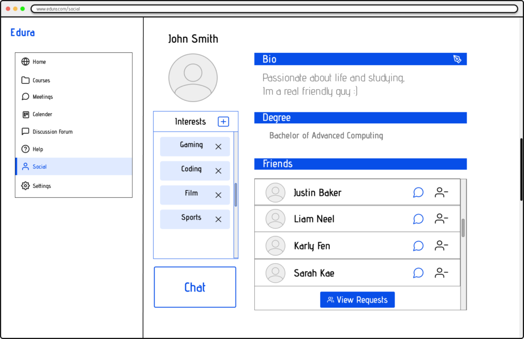
Socials Bio Page: Users can access the bio of friends and peers.
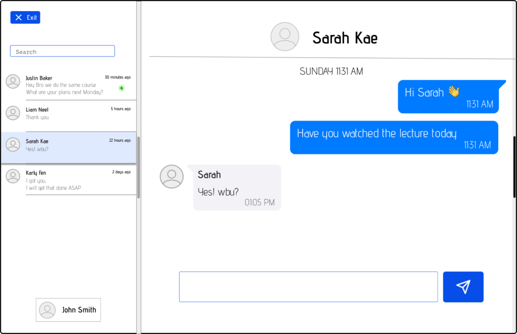
Chat Page: Friends from the socials list can send other user messages.
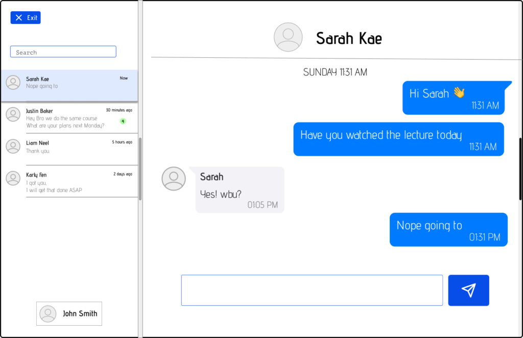
Reply to Chat: Users can respond to chats through the textfield.
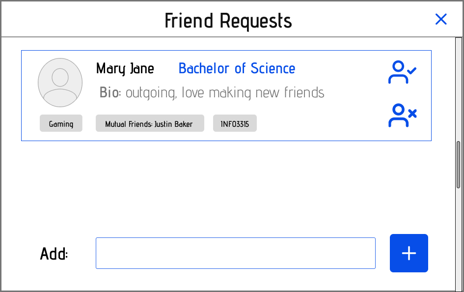
Add Friends Page: Users can send friend invites with a message. Start conversations and make new friends.
Friend Request Page: Users can see a list of all follow requests from other peers.
Settings Webpage
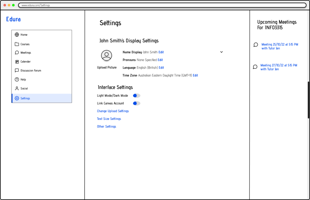
Settings Page: Users can access and make changes to the settings to their Edura accounts.
Validation
Edura successfully addresses the challenge of remote learning by centralising essential academic resources. Despite the constrained timeframe, our iterative design process ensured a robust and user-friendly prototype. Future work will focus on expanding user testing and refining the prototype based on comprehensive user feedback, ensuring Edura meets the evolving needs of remote learners.
